

Data: 25/03/2025
Corporate logos are more than just visual representations—they are symbols that communicate a brand’s identity and values.
Creating a corporate logo is a process that involves several essential steps to ensure the final result is unique, memorable, and effective.
From initial research to final refinements, every phase plays a crucial role in building a visual identity that truly connects with your audience.
In this article, I’ll walk you through the step-by-step process of creating a corporate logo, highlighting the most important stages and strategic decisions along the way.
Understanding how the logo design process works is key for any business that wants to stand out and build a strong, lasting brand. Let’s get started!
💡 What you’ll learn:
- What is a corporate logo?
- The key components of a logo
- Real world logo examples
- How to design your corporate logo
What Is a Corporate Logo?
A corporate logo is a symbol—often combined with text and graphic elements—that helps customers identify and distinguish your brand. It’s a cornerstone of your visual identity.
According to the article “What is a Logo?: Explained Meaning and History” published on Medium, a logo can be a symbol, a wordmark, or a combination of both that is legally protected as a trademark (™) or registered mark (®).
However, a logo goes beyond legal protection.
Think of your favorite brand—its logo probably pops into your mind instantly, right? That’s the power of great design. A well-crafted corporate logo creates emotional connection and brand recognition.
It not only sets your business apart from competitors but reinforces your identity at every customer touchpoint—and protects your intellectual property.
Logo Components: What Makes a Great Corporate Logo?
Designing a corporate logo means blending multiple elements into a cohesive and impactful visual system. Here are the key building blocks:
Typography
The typeface you choose is a visual signature of your brand. It can be modern, classic, playful, or formal—what matters is that it aligns with your brand’s message and tone.
Symbol or Icon
Symbols or icons can strengthen your brand identity by providing an instantly recognizable visual reference that complements your company name.
Color Palette
Color psychology plays a huge role in branding. Your logo’s color palette should reflect your values, market positioning, and the emotions you want to evoke.
Spacing
Proper spacing between logo elements ensures readability and visual balance. Smart use of white space can make a logo feel more polished and professional.
Shape
Shapes influence perception. Rounded forms can suggest warmth and approachability, while angular designs convey innovation and energy.
Style
The logo’s style should match your overall brand personality. Whether minimalist, vintage, bold, or refined—it needs to visually express who you are.
Size
A great corporate logo must scale effortlessly—from billboards to app icons—without losing clarity or impact.
Balance
A balanced composition ensures that no part of the logo overpowers another. Harmony between typography and graphics is essential.
Versatility
Your logo should work across all mediums—digital and print, in full color or black and white. A strong design keeps its integrity no matter the context.
Visual Identity Integration
Your logo should align with your brand’s broader visual identity. It’s not just a standalone element—it works in harmony with other branding assets like fonts, colors, and graphics.
→ Pro tip: Build a unique, memorable visual identity that truly represents your company.
Corporate Logo Examples
Iconic logos don’t just represent brands—they become symbols recognized worldwide. Let’s look at some famous logos and the stories behind them.
Coca-Cola

One of the most iconic logos of all time, Coca-Cola’s mark was created in 1886 using elegant Spencerian Script typography. Its bold red color evokes energy, excitement, and passion.
Consistency and simplicity have made it timeless and unforgettable.

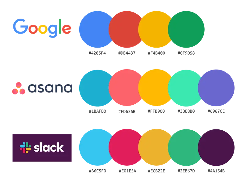
Google’s logo is a masterclass in modern simplicity. The clean, sans-serif typeface feels friendly and accessible, while the primary color palette (blue, red, yellow, green) adds a sense of playfulness and creativity.
Small tweaks over time have kept the logo fresh while staying true to its identity.
Amazon

Amazon’s logo features more than just a name—it tells a story. The arrow from “A” to “Z” represents the brand’s vast product selection and also doubles as a smile, symbolizing customer satisfaction.
Its black typography communicates professionalism, while the orange arrow adds warmth and energy.
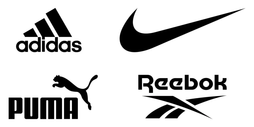
Adidas

The three stripes in Adidas’s logo symbolize performance and durability. It’s minimalist, geometric, and instantly recognizable—perfect for both athletic wear and global campaigns.
The simple black color and no-frills typography evoke authority and strength in the sportswear market.
How to Create a Corporate Logo
Designing a corporate logo is a creative journey made up of strategic steps. Each phase builds on the next, helping you create a design that not only looks great—but connects with your audience.
Let’s break down the essentials:
1. Understand the Brand
Everything starts with clarity. Get to know the brand inside out—its mission, values, target audience, and market positioning.
Ask key questions:
- What makes this brand unique?
- What emotions should the logo evoke?
This foundation will shape every design decision.
2. Define the Logo Style
Your logo style should match your brand’s personality—whether that’s modern, timeless, playful, minimalist, or bold.
Explore different styles, brainstorm with your team or client, and determine what direction best reflects the brand’s identity.
3. Choose the Right Color Palette
Color plays a major role in emotional perception. Select a palette that aligns with your brand values and stands out in your industry.
Tip: Research competitors in your niche. Look at the colors they use and how they position themselves emotionally. Then, find a palette that both resonates and differentiates.
- Pick a Typeface
Typography sets the tone.
For modern, innovative brands, a clean sans-serif (like LinkedIn’s) often works best:

For more traditional or upscale brands, a serif font (like Vogue’s) may be more appropriate:

Test different options and find the one that best complements your overall design.
5. Incorporate Visual Elements and Symbols
Visual elements like icons, shapes, and custom graphics add meaning and depth to your logo.
Make sure these elements are relevant to the brand and elevate—not clutter—the final design.
6. Sketch and Conceptualize
Before diving into digital tools, start with hand-drawn sketches. It’s a fast way to explore ideas without limitations.
Draw multiple variations and identify the strongest concepts to develop further. Sketching helps you discover creative directions you might otherwise miss.
7. Ensure Scalability and Legibility
A professional corporate logo must work across sizes—from massive signage to tiny mobile app icons.
Always test the logo in different scenarios to ensure clarity and impact at every scale.
8. Final Refinements
Once you’ve developed a solid version, it’s time for polishing. Refine the typography, adjust the spacing, tweak the colors—pay attention to every detail.
Aim for perfection. Your logo should look and feel just right.
9. Create Logo Variations
Your brand will need logo versions for different use cases—like black-and-white formats, simplified icons, or adaptable versions for various backgrounds.
For example:
- The primary logo on your website
- A compact variation for social media
- A monochrome version for print materials
These variations keep your branding consistent, no matter the context.
10. Prepare Final Files in All Required Formats
Export your corporate logo in multiple formats like JPEG, PNG, SVG, and PDF.
Each format serves different needs—whether it's print, digital platforms, or app design. Deliver a complete file kit, so your logo can be used everywhere without hassle.
11. Register the Logo for Trademark Protection
Registering your corporate logo is a vital step in protecting your brand. Legal registration secures your exclusive rights and prevents unauthorized use.
Here at BYB, we always recommend working with a legal advisor to ensure your logo is properly trademarked.
Ready to Elevate Your Corporate Logo with BYB?
See how every stage of creating a corporate logo is both detailed and creative? At BYB, we get how important a bold and cohesive visual identity is.
Our team of experts is here to help you craft a logo that captures your brand's essence and communicates it with impact.
If you’re ready to take your brand identity to the next level, we’ve got you.
Get in touch with BYB today and let’s build a standout brand together.

